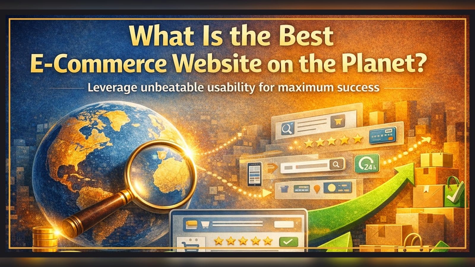
What Is the Best E-Commerce Website on the Planet?

The best one is the one that doesn't exist.
Not because websites are useless, and not because you should rebuild from scratch.
Because every interface is a barrier unless it helps the product decision.
Usability is how you make that barrier as thin as possible.
As an e-commerce operator, I do not treat the website as a design artifact.
I treat it as a decision engine that must work under constraints: limited attention, imperfect content, trust risk, and operational reality.
That is why the first usability decisions are managerial decisions: what job the website serves, what assortment can win online, and what signals we can actually produce and maintain.
A customer has a problem.
A product that solves it exists.
Everything between the customer and that product is either help or friction.
The rest of this article is a way to think about that friction so you can remove it.
The first usability decisions happen before design: why and what
Usability does not start with layout, buttons, or visual design.
It starts earlier, with two decisions:
- why this website exists
- what products it will represent
If you get either decision wrong, you can build a polished interface and still fail, because you remove friction in the wrong place or try to sell the wrong items in the wrong channel.
Define what the website is for
Different businesses use e-commerce websites for different jobs:
- Transaction-first (B2C store): help customers discover, evaluate, trust, and buy online.
- Offline-led or omnichannel retail: reduce uncertainty and drive a store visit. Contact, location, appointment, availability, and promotions can matter more than checkout.
- B2B or procurement: controlled purchasing. Accuracy, reorder speed, account pricing, approvals, documentation, predictable fulfillment.
The same interface patterns do not work equally well across these models, because success means different things.
Choose an assortment that can win online
Offline winners are not automatically online winners.
Online shopping relies on signals that replace what the offline environment gives for free.
Common failure modes:
- The product needs tactile evaluation (feel, fit, comfort, weight, texture).
- The purchase depends on expert guidance or service (fitting, configuration, installation).
- The value is hard to communicate through standard content.
- Trust and risk are higher online, so weak proof and weak policies get punished.
- Online comparison is instant, so weak differentiation loses fast.
You cannot UI your way out of a product that customers cannot evaluate and trust online.
List only products you can represent with decision-grade signals
Even the right product can fail if you represent it poorly.
If a listing has weak content - few images, unclear specs, no video, missing context, vague description - you have already created friction and uncertainty.
No layout can fully compensate for missing signals.
This is where long tail becomes expensive.
If the manufacturer does not supply strong product content, the burden shifts to you.
You must create the missing signals yourself: images, videos, specs, comparison context, and clear descriptions.
With thousands of long-tail items, those content costs can explode while each item may sell only a handful of times per year.
So one of the first usability decisions is an assortment and content decision:
- prefer products that already come with complete, decision-grade content
- avoid listing items that require heavy content work unless the business case is clear
A note on dropshipping:
Dropshipping can make it easy to expand a catalog quickly.
But it can also amplify the content problem.
If suppliers do not provide strong product content, you inherit the work of creating signals at scale, while still owning the customer experience and the trust risk.
A bigger dropship catalog is not automatically a usability win.
It can become a friction factory unless content quality is controlled.
Everything else in usability is downstream from these choices.
These are not UX-only decisions.
They sit across merchandising, content operations, marketing entry points, and customer experience policies.
If those owners are not aligned, usability becomes a patchwork of local optimizations.
Human limits are the starting point
Most usability problems are not about intelligence.
They are about constraints.
People are tired, distracted, and on small screens.
They have imperfect vision, imperfect motor control, and imperfect memory.
Some limitations are visible. Many are not.
That is why signal-to-noise ratio matters more than cleverness.
Intent and selective attention
A customer does not come to your site to browse your site.
They come to solve a problem.
Even if you have millions of items, the customer is focused on one outcome: finding the right product.
They notice the signals that match their intent and ignore the rest.
This is why product pages and listings are not content pages.
They are decision surfaces.
Facets live in the customer's head
Customers filter long before your UI filters.
They carry mental facets: price range, size, color, compatibility, brand, rating expectations, and many micro-facets that never show up in your navigation.
A short search query often acts as a type selector.
It narrows the universe to a category, and then the customer applies micro-facets by scanning.
Those facets are not static.
They evolve during browsing as the customer learns what is possible, what is normal, and what tradeoffs exist.
Long tail wins when it increases the chance that you carry the exact facet combination in the customer's head.
Entry context is the first filter
How customers browse a site often depends less on their preference and more on where they start.
Entry context is the first filter.
Search is not only the SearchBox.
It is a catalog query engine that powers multiple entry points: navigation, SEO landing pages, and paid landing experiences.
So the first filter may happen outside the SearchBox, before the customer even starts browsing.
- Landing on a relevant page (ads, shopping, targeted SEO): the universe is already narrowed. Customers often scan and apply micro-facets mentally.
- Starting from a generic entry (home page, direct): search is the fastest way to create the first-level filter.
A practical usability win here is guidance before Enter.
Good autosuggest and refinements reduce typing, reformulations, and dead ends, especially on mobile where the keyboard steals the viewport.
Treat raw usage percentages as signals, not proof. Context defines the workflow.
Decision-grade signals and information hygiene
Customers do not buy UI elements.
They buy the product, and they buy confidence that the product will solve their problem.
Decision-grade signals are the minimal set of cues that let a customer decide with low effort.
Information hygiene is protecting the signal-to-noise ratio.
Avoid decorative noise, duplicated elements, and inconsistent claims.
RISC - a simple decision script
Customers do not read your page top to bottom.
They run a fast decision script.
RISC is one way to think about it:
- Recognition: confirm you are in the right place.
- Intent: check fit and constraints.
- Signals: look for proof and differentiation.
- Confidence: reduce risk and finalize the decision.
RISC is the sequence.
Decision-grade signals are the content.
Applied solutions - how the approach becomes real in product browsing and buying
This approach only works when it is operationalized.
I treat it as a loop:
- extract the uncertainty map (questions)
- translate it into content standards (images, titles, descriptions)
- enforce consistency across surfaces
- review and refine based on observed friction points
Below are practical implementations of the approach above. Use them as a checklist, not as a rigid template.
Product questions reveal customer pain better than product reviews
If you want to understand what blocks a purchase, one of the highest-signal sources is customer questions.
A practical technique: go to a large marketplace (for example Amazon) and read the Q&A section for products in your category.
Questions are asked by people who are still in buying mode.
They reveal the uncertainties that must be resolved before the customer commits.
Reviews are useful too, but they have two biases:
- they are written after purchase
- they over-represent disappointment
Questions tell you what your product content must answer upfront.
Turn questions into an uncertainty map
- Collect repeated questions across several top products.
- Cluster them into themes.
- Map each theme to a customer uncertainty: Fit, Use, Proof, Risk.
- Ensure your content answers the top themes without forcing the customer to hunt.
The product is the hero, not the interface
Customers do not buy your logo, your button style, or the aesthetic of your navigation.
They buy a product to solve a problem.
So the main character on an e-commerce website is the product.
Everything else should support the product decision and stay out of the way.
This mindset changes how you design:
- product signals should be the most visible elements
- interface elements should be quiet and predictable
- decoration is acceptable only when it improves recognition, trust, or clarity
Website color palette - start neutral, add color only with a job
Color is a powerful signal, which means it can also become powerful noise.
Start with a mostly neutral interface (white, black, controlled grays), and add color only where it has a clear role.
Neutral does not mean low contrast.
It means disciplined color roles and consistent meaning.
Legitimate roles for color:
- primary actions vs secondary actions
- status and urgency (errors, warnings, success)
- emphasis for a small number of key cues
If the interface itself is highly colorful, customers lose focus.
Product images should be the most colorful part of the experience.
The site chrome should amplify signals, not compete with them.
Product titles - a micro-description, not manufacturer text
Title construction should reflect what customers value first.
- If the product is brand-driven, start with the brand.
- If the product is generic, start with the product type customers recognize.
Then add one differentiator - a micro-facet embedded in the title.
Secondary attributes belong only if they reduce uncertainty.
The first words must carry the meaning, because mobile screens truncate fast.
Product images - treat the gallery as a decision narrative
People want to look. They do not want to read.
In many categories, the most stable product-page behavior is that customers start by swiping images.
So images are not decoration.
They are decision bandwidth.
Use RISC to curate image sequencing:
- Recognition: confirm the click with a consistent primary visual.
- Intent: confirm the key fit facets (size, compatibility cues, key functions).
- Signals: show evidence (materials, close-ups, packaging, real-world context).
- Confidence: reduce trust risk (brand authenticity cues, warranty, support, policy cues).
Do not let images cannibalize each other.
Every image should answer one question.
Product overview - a short, decision-grade summary
On most product pages, the title sits above the primary image.
Right after that primary image, many customers want a fast answer to one question:
Is this the right product for me?
A Product Overview is a short block that compresses what matters most into a few scannable lines.
It is not a full description.
It is a decision snapshot.
What it should contain:
- one concrete user benefit in plain language
- a short list of key features, ordered by what decides the choice
- critical fit constraints (dimensions, materials, compatibility) when relevant
- a small trust cue when appropriate (for example rating volume or warranty)
The overview should be readable in seconds and work on mobile.
Then the longer Product Description can do its job: explain edge cases, add context, and answer deeper questions.
Product descriptions - do not write essays, sequence signals
A good description is not a wall of text.
It is a sequenced answer to the uncertainty map.
A practical structure:
- outcome and who it is for (Recognition)
- constraints and differentiators that decide fit (Intent)
- proof block: what supports the claims (Signals)
- risk block: what is included, what is not, warranty and returns, edge cases (Confidence)
Product listing cards - a compressed decision surface
A listing is where a large share of decisions happen while scrolling.
A practical sequence inside a listing card:
- image (Recognition)
- title (what it is)
- second line (why it is different)
- badges and rating (trust and execution cues)
- a small set of key attributes (Intent)
- price and promo (Execution)
The second line
In listings, keep the title short and add a short second line under it.
This is a micro-description that highlights the key differentiator that may not fit cleanly into the title.
One scannable cue that answers: why should I look at this one?
Product recommendations - borrowed micro-facets from behavior
Recommendation modules like Customers also viewed, Customers also bought, Frequently bought together, or People who bought this also bought look simple.
Conceptually they try to infer micro-facets that are not explicitly represented in your filter UI.
- From the current shopper: what they viewed, compared, and returned to.
- From previous shoppers: which items tend to co-occur in real decision paths.
Recommendations are signals, not truth.
Treat them like a helpful hint, not a guarantee.
Used well, recommendations compress discovery while the customer refines dynamic facets.
Product ordering matters - the list is part of the interface
Most teams treat ordering as a backend topic.
But for the customer, ordering is part of the interface.
The order of items in a list is a signal. It tells the shopper what the site thinks is most relevant, most popular, most trustworthy, or best aligned with the task.
On true long-tail catalogs, good merchandising is not about picking favorites.
It is about a reliable policy for what appears above the fold and how the rest of the list keeps learning.
Think policy, not one perfect sorting algorithm
There is no universal deterministic sort that is always right.
Demand shifts, promotions change behavior, stock changes conversion, content improves, and seasonality reshapes what works.
So the usability goal is stability for humans plus continuous learning for the system.
Simple beats smart when signals are sparse
In sparse long-tail data, feature-heavy models built from dozens of weak signals often become noise in, noise out.
Prioritize signal quality over signal volume and keep the logic explainable.
Avoid manual pinning
Manual bestseller pinning freezes the page around internal opinions.
Pinned positions absorb exposure, the list stops learning, and the site disconnects from current demand.
A practical structure that stays usable
Above-the-fold is where you either reduce effort or waste it.
So the list needs a policy:
- protect the top with proven demand so the customer sees credible candidates fast
- reserve controlled space to discover new and low-volume items so the list does not freeze
Instead of one global sort, structure the listing into zones with a clear purpose.
Within zones, use simple controlled rotation so items below the very top can collect data without making the list feel chaotic.
Practical usability rules:
- keep ordering stable within a session so customers can continue where they left off
- allow controlled movement over time so better matches earn more exposure
- preserve a small amount of exploration so you can discover new winners and avoid tunnel vision
Filtering out obvious noise (bots, scanners, accidental events) is often more important than adding new features to the model.
Ordering cannot rescue weak product content.
It only allocates attention among candidates.
So decision-grade signals come first, and ordering amplifies what the signals already make possible.
Consistency across surfaces
Customers do not reset their brain between an ad landing, a listing, and a product page.
If the first image, the title meaning, or the key claim changes, you create doubt.
So keep the product story consistent:
- same primary image logic
- same core claim and differentiator
- same key constraints surfaced early
Consistency reduces cognitive load and strengthens trust.
Checkout usability - treat checkout as an input quality system
Checkout is not just a form. It is where messy human typing becomes operational reality.
Small input errors turn into shipping exceptions, payment failures, support tickets, and manual review.
So the usability goal is not to add more logic.
It is to reduce typing, prevent avoidable mistakes, and capture clean, reliable inputs.
Practical principles:
- bias the UI toward selection and guided entry, especially on mobile
- use field-level guardrails: the right keyboard type, character constraints, lightweight formatting
- keep core validation deterministic and auditable
- separate speed from certainty: capture intent fast, then standardize and verify after checkout, before fulfillment
This protects conversion while still improving fulfillment quality and trust.
Closing
Usability is the art of removing work and removing doubt.
When you broadcast decision-grade signals, protect the signal-to-noise ratio, and sequence information in the order customers naturally process it, customers do not need to learn your site.
They can simply buy.